ABOUT
In Brazil, ETFs account for less than 1% of the total stock market — a stark contrast to the U.S., where they represent over 50%. The potential for growth is undeniable. At the center of this opportunity is Teva Indices, a company that combines financial science, market indexing, insights, and technology to develop some of the most efficient ETFs in the Brazilian market — with over 150 indices calculated daily. Because every ETF is built on an index, Teva’s role is foundational. The company doesn’t just participate in the ecosystem — it builds it. With solid market presence and a track record of delivering high-impact financial products, Teva reached a moment of inflection: it needed a brand system that matched the scale and ambition of its purpose. From positioning to identity, the goal was to clearly communicate its difference — and distance itself from traditional financial brands.
STRATEGY
Working in close collaboration with the Teva team, we immersed ourselves in their culture, tools, and way of thinking. From their internal knowledge to a surprisingly intimate library of books, financial journals, and editorial layouts, we uncovered a world of references rooted in bold grids and information-first design. Guided by deep strategic research and brand analysis, we arrived at a clear and resonant brand purpose: “Building the foundations of financial evolution.” This idea became the strategic compass — anchoring every decision, shaping the visual language, and informing how the brand shows up across every touchpoint.
TYPOGRAPHY
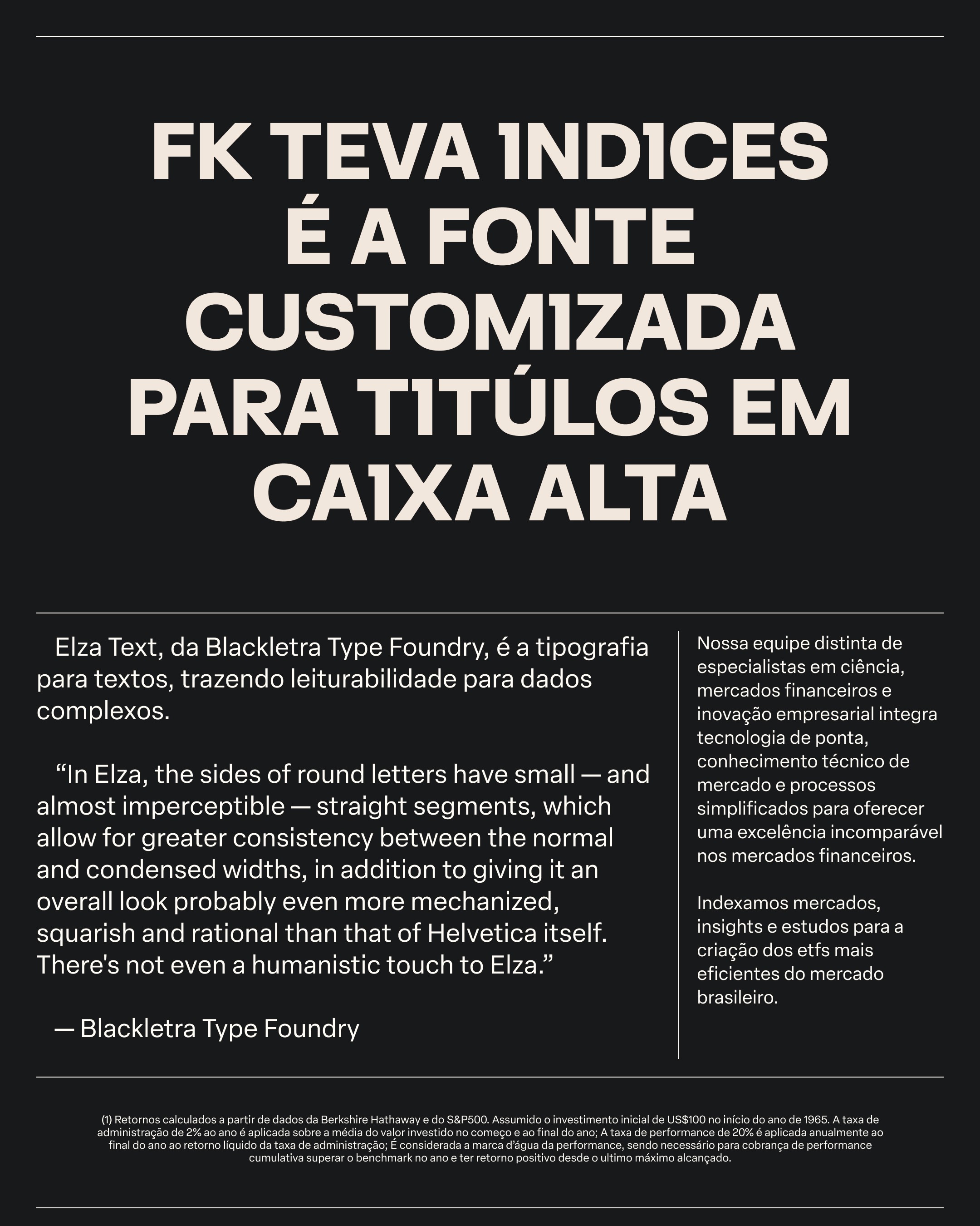
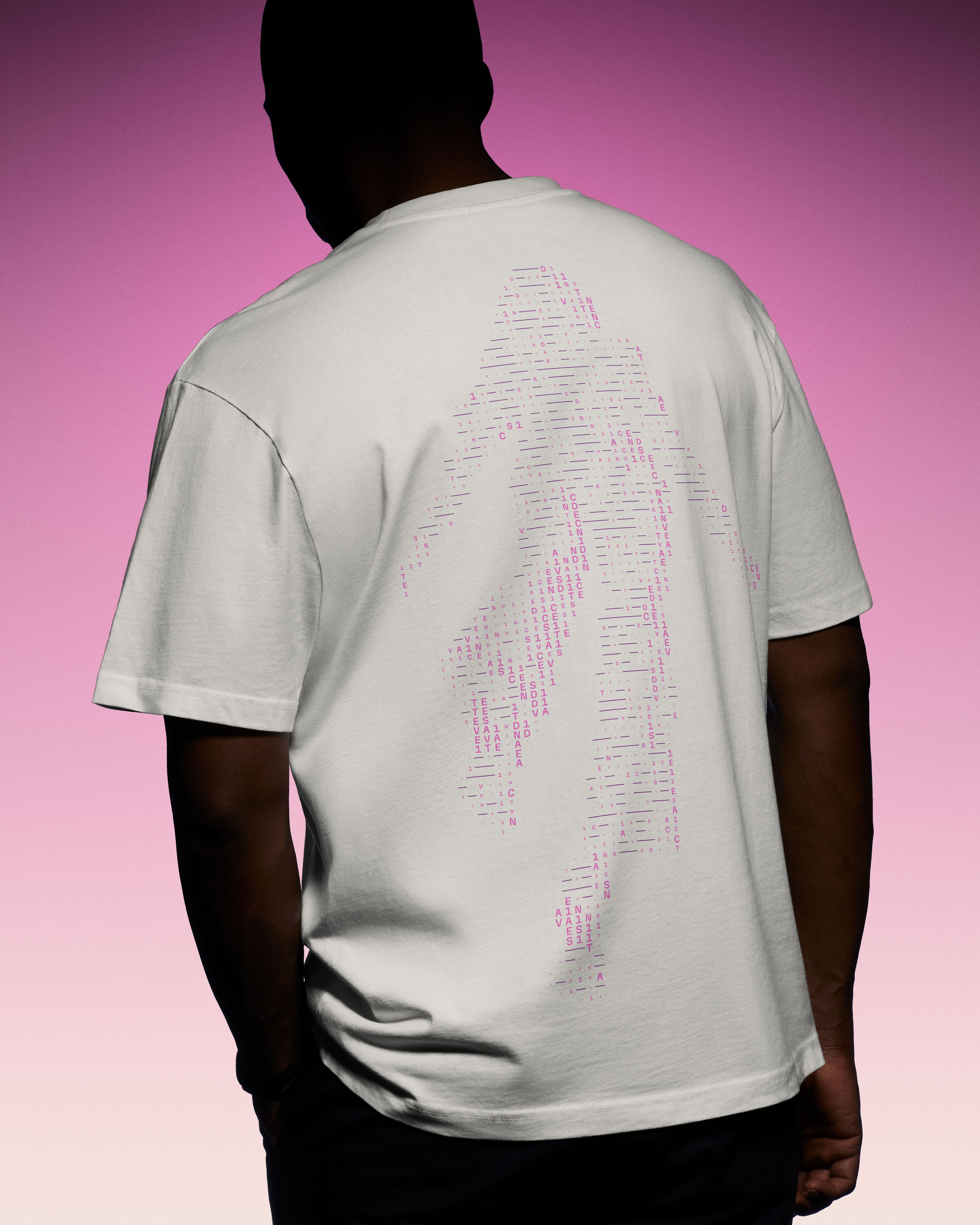
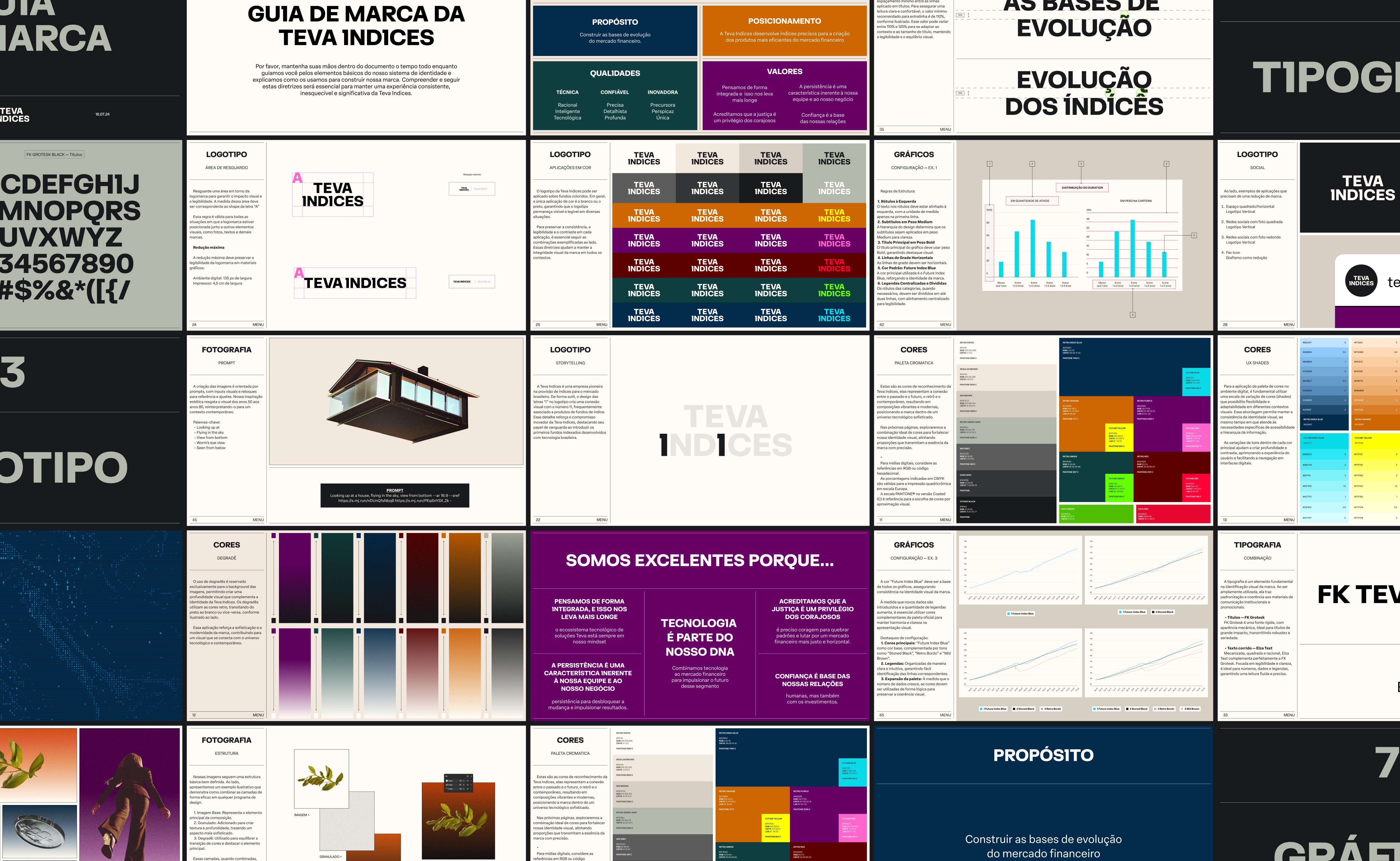
A wordmark whice once was thin and fragile became bold and assertive. The word “Índices” was strategically weighted, placed as the base. A subtle yet intentional type refinement lies in the double “I” — evoking the number “11,” a reference to Brazil’s ETF naming convention (on B3, ETFs end in “11”). This detail turns the brand into a code-savvy signal to insiders, without compromising accessibility to retail investors. The type system pairs boldness with clarity. The primary display font mirrors the wordmark — strong, geometric, and custom-kerned to reinforce brand consistency. A bespoke “I” ties the two together, adding a quiet continuity across headlines. To support the data-heavy nature of Teva’s communication — including regulatory disclosures and index performance — we introduced Elza Text, a Brazilian modernist typeface optimized for readability. This dual-type approach balances authority and functionality across every touchpoint.
IMAGERY
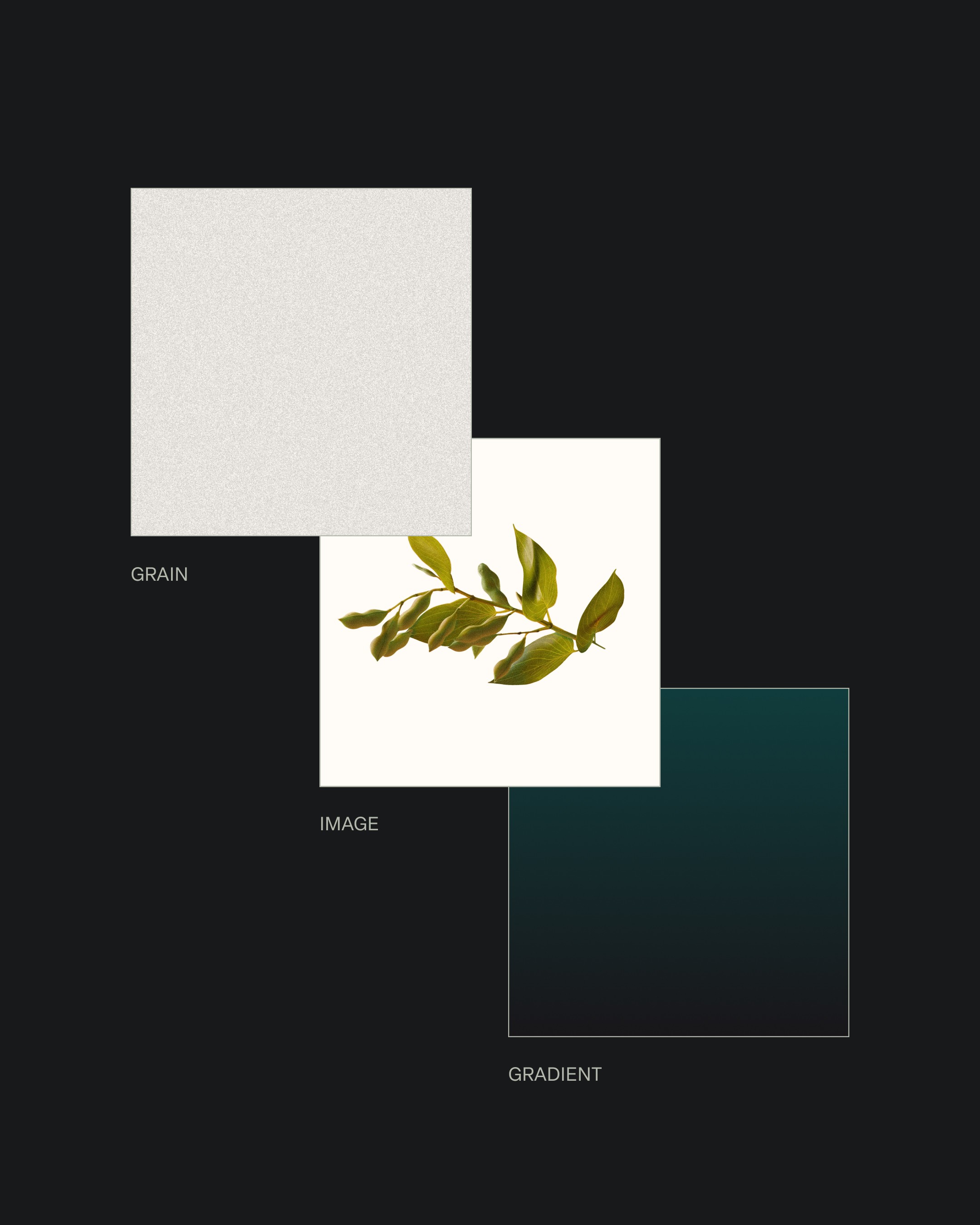
The color palette bridges past and future. Drawing from vintage tones, we honored the legacy of print-era financial design while introducing a high-saturation RGB spectrum that gives the system a digital-forward punch. The result is a brand that feels informed by history — but designed for tomorrow. In a market saturated with cliché stock photography and skyline clichés, we chose to challenge the status quo. AI-generated imagery was introduced as a deliberate visual provocation — surreal, symbolic, and systematized — representing each product through unique, otherworldly perspectives. These visuals position Teva not only as a financial brand, but as a cultural one.
CREATIVE CODE
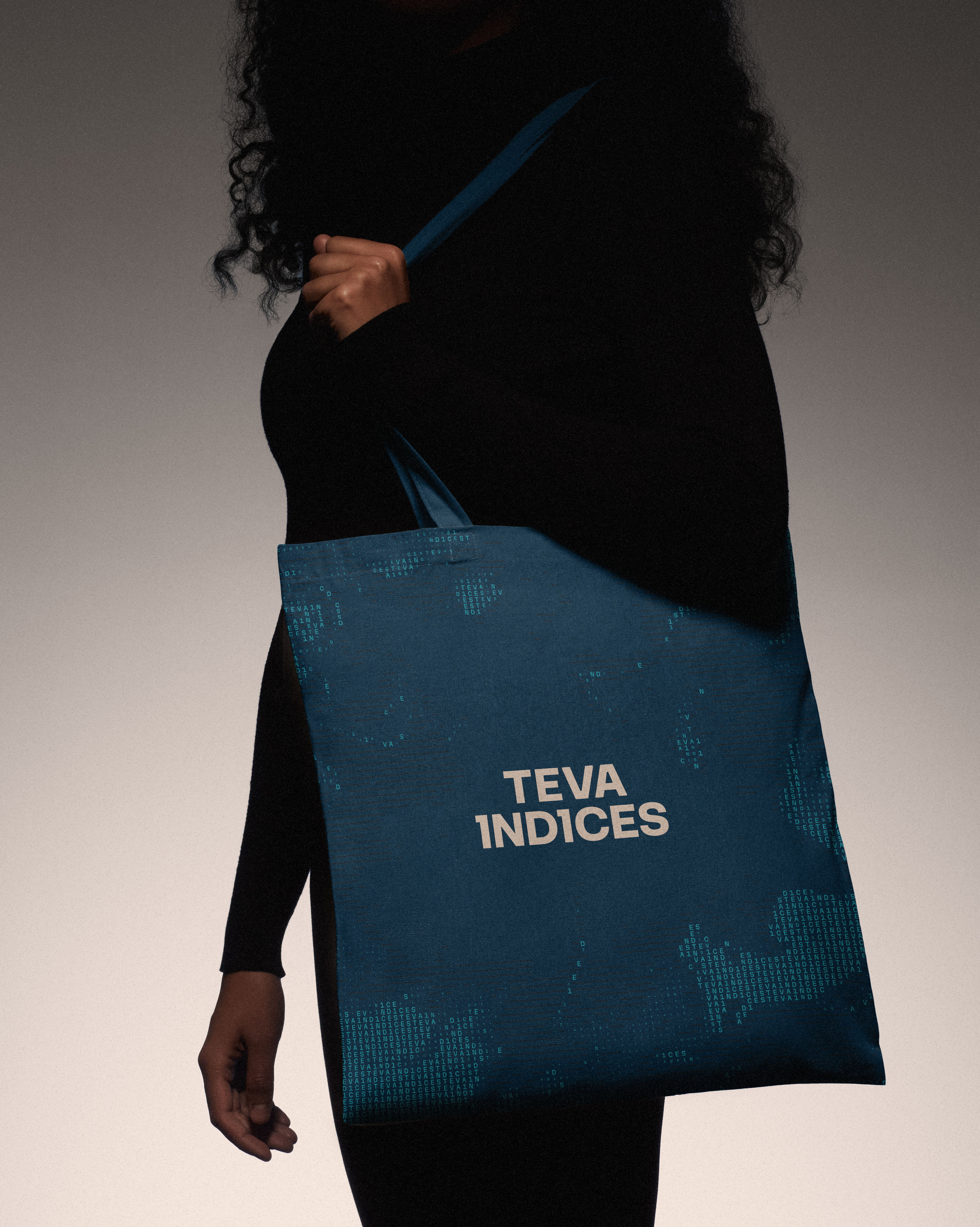
We also created a custom tool to express the science behind Teva’s indices. Inspired by data flows and pricing algorithms, the generative pattern system visually translates complex information into digestible, dynamic shapes — playful without diluting sophistication.
MOTION BEHAVIOR
Motion behavior was designed to reflect Teva’s core metaphor: building a new market infrastructure. Animations reveal elements block by block, rising from the bottom up — just like a foundation being laid.
DIGITAL
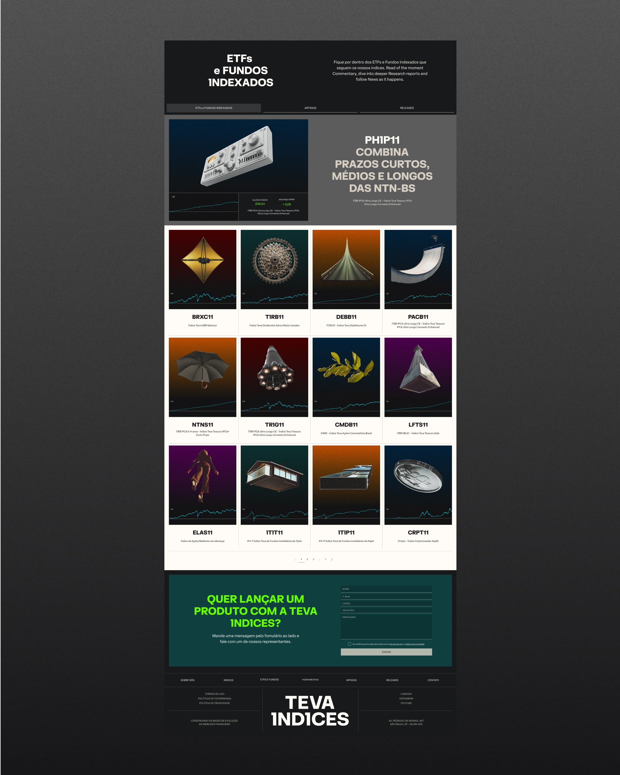
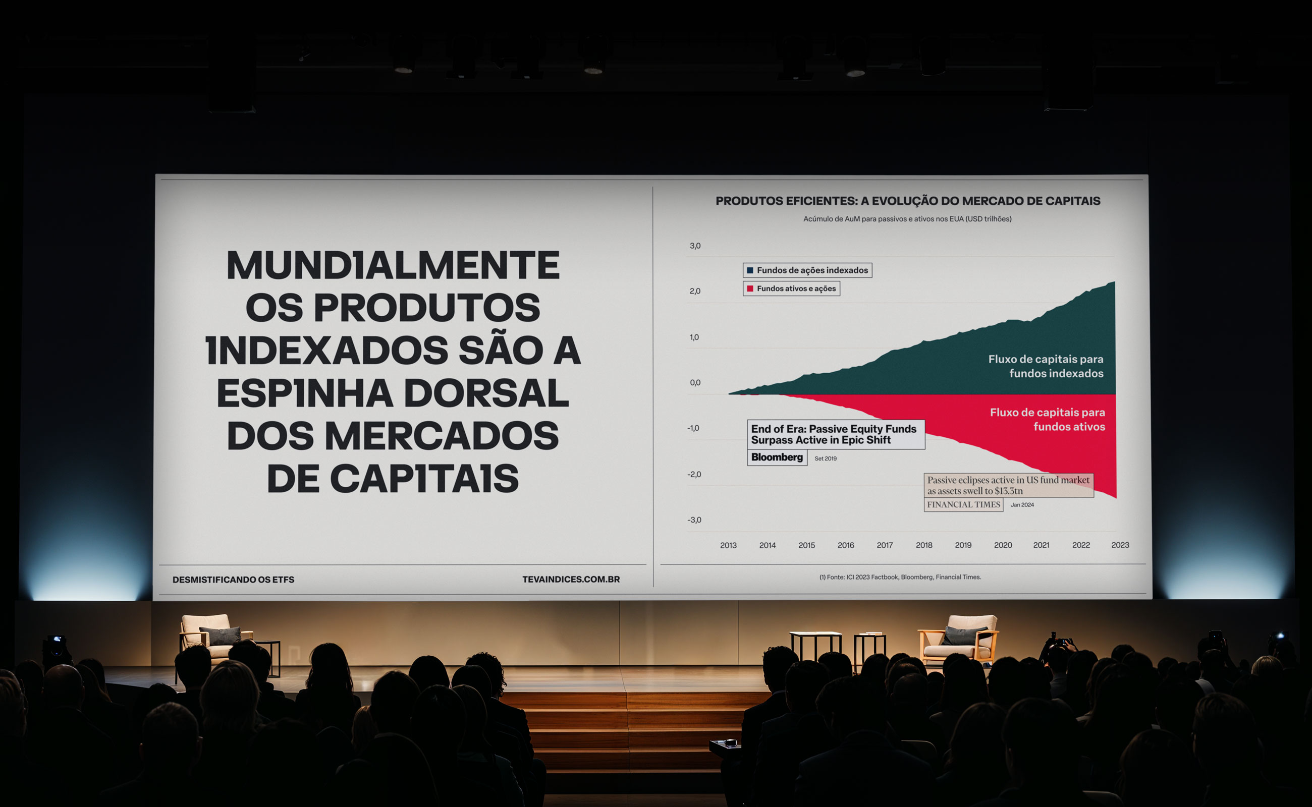
The new website borrows cues from classic editorial layouts — modular columns, typographic hierarchy, and content rhythm. This approach invites users to read the brand, not just browse it. The experience is intentionally tactile and information-driven, offering an environment that feels both serious and inviting.
CREDITS
Com mais de 15 anos de experiência no mercado, a Geonav estabeleceu uma sólida reputação no setor B2B, oferecendo soluções tecnológicas que descomplicam a vida das pessoas. Com um portfólio abrangente, a empresa oferece desde cabos e carregadores até produtos para automação residencial. Ao longo dos anos, a Geonav tem se destacado por fornecer produtos e serviços inovadores, que facilitam o dia a dia das pessoas e promovem um melhor relacionamento com a tecnologia.
BRAND STRATEGY
VISUAL IDENTITY
CUSTOM TOOL
LOGO
CUSTOM TYPE
WEBSITE
MOTION
BRAND STRATEGY
VISUAL IDENTITY
CUSTOM TOOL
LOGO
CUSTOM TYPE
WEBSITE
MOTION
ABOUT
In Brazil, ETFs account for less than 1% of the total stock market — a stark contrast to the U.S., where they represent over 50%. The potential for growth is undeniable. At the center of this opportunity is Teva Indices, a company that combines financial science, market indexing, insights, and technology to develop some of the most efficient ETFs in the Brazilian market — with over 150 indices calculated daily. Because every ETF is built on an index, Teva’s role is foundational. The company doesn’t just participate in the ecosystem — it builds it. With solid market presence and a track record of delivering high-impact financial products, Teva reached a moment of inflection: it needed a brand system that matched the scale and ambition of its purpose. From positioning to identity, the goal was to clearly communicate its difference — and distance itself from traditional financial brands.
STRATEGY
Working in close collaboration with the Teva team, we immersed ourselves in their culture, tools, and way of thinking. From their internal knowledge to a surprisingly intimate library of books, financial journals, and editorial layouts, we uncovered a world of references rooted in bold grids and information-first design. Guided by deep strategic research and brand analysis, we arrived at a clear and resonant brand purpose: “Building the foundations of financial evolution.” This idea became the strategic compass — anchoring every decision, shaping the visual language, and informing how the brand shows up across every touchpoint.
TYPOGRAPHY
A wordmark whice once was thin and fragile became bold and assertive. The word “Índices” was strategically weighted, placed as the base. A subtle yet intentional type refinement lies in the double “I” — evoking the number “11,” a reference to Brazil’s ETF naming convention (on B3, ETFs end in “11”). This detail turns the brand into a code-savvy signal to insiders, without compromising accessibility to retail investors. The type system pairs boldness with clarity. The primary display font mirrors the wordmark — strong, geometric, and custom-kerned to reinforce brand consistency. A bespoke “I” ties the two together, adding a quiet continuity across headlines. To support the data-heavy nature of Teva’s communication — including regulatory disclosures and index performance — we introduced Elza Text, a Brazilian modernist typeface optimized for readability. This dual-type approach balances authority and functionality across every touchpoint.
IMAGERY
The color palette bridges past and future. Drawing from vintage tones, we honored the legacy of print-era financial design while introducing a high-saturation RGB spectrum that gives the system a digital-forward punch. The result is a brand that feels informed by history — but designed for tomorrow. In a market saturated with cliché stock photography and skyline clichés, we chose to challenge the status quo. AI-generated imagery was introduced as a deliberate visual provocation — surreal, symbolic, and systematized — representing each product through unique, otherworldly perspectives. These visuals position Teva not only as a financial brand, but as a cultural one.
CREATIVE CODE
We also created a custom tool to express the science behind Teva’s indices. Inspired by data flows and pricing algorithms, the generative pattern system visually translates complex information into digestible, dynamic shapes — playful without diluting sophistication.
MOTION BEHAVIOR
Motion behavior was designed to reflect Teva’s core metaphor: building a new market infrastructure. Animations reveal elements block by block, rising from the bottom up — just like a foundation being laid.
DIGITAL
The new website borrows cues from classic editorial layouts — modular columns, typographic hierarchy, and content rhythm. This approach invites users to read the brand, not just browse it. The experience is intentionally tactile and information-driven, offering an environment that feels both serious and inviting.
CREDITS
Com mais de 15 anos de experiência no mercado, a Geonav estabeleceu uma sólida reputação no setor B2B, oferecendo soluções tecnológicas que descomplicam a vida das pessoas. Com um portfólio abrangente, a empresa oferece desde cabos e carregadores até produtos para automação residencial. Ao longo dos anos, a Geonav tem se destacado por fornecer produtos e serviços inovadores, que facilitam o dia a dia das pessoas e promovem um melhor relacionamento com a tecnologia.


SAY HI →
SAY HI →